Liam Roberts BAGD YR2
This blog will show the research and development of my second year in Futureworks University doing the BA(hons) Games Design course.
Labels
Friday, 19 April 2013
Modular Level Beauty Shots
Had a hard time with this on two different ends. The kismet didn't go at all well while the level took ages to make. So most of the level was designed and edited quickly. The kismet was actually atrocious and the level assets even though looking nice, needed to work better in both size and how they blend together.
The final outcome of the image though, I was glad it got where it did. The final result looking nice and overall happy with what i made in the time constraints of creation.
Mulefa Models Re-Done
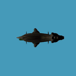
This is my re-do of my mulefa modelling, following the guidelines of the review given to me by Ken. I think ive improved a lot since from the last model. I've added a small design to the back of the model. The texture is generally beter then the previous so overall im happy with the new mulefa model and texture design.
PETE!!
Just thought i'd add this pete, my loevel ive done for the last submission, i know your marking mainly the kismet. Look at the new one ive posted for ken, the graphics look a lot nicer as i figured out the issues with the last one. the kismet (as small as it is) is the same
Thursday, 18 April 2013
Modular Texture Sheet
Really happy with the rendering of these texture sheets. They suit my style of art well and focused quite a bit of my time into them. I do think I had spent too much time in these and prepared myself for anything when it came to the modular assets. So this basically reduced the amount or individual assets which overall makes my level less full. I'm an idiot. Bu, for what its worth, I do like these and in game (when the opacity maps work), it actually looks nice and beldn well with the light.
Specular and normal maps i didn't do on these due to the reason I thought they didn't have much place on my models due to my art style.
Subscribe to:
Comments (Atom)


